Last week I attended a D.C. Art Science Evening Rendezvous (DASER) at the National Academies in my hometown, Washington, DC. These events are held once a month and provide a forum to discuss art and science projects in the national capital region and beyond. This month’s theme was Data Visualization, the process of creating infographics. I had long been familiar with the concept of data visualization but only recently come across the term infographics, so the topic was very timely.
Infographics (short for Information Graphics) are graphic visual representations of information, data or knowledge. They are intended to present complex information quickly and clearly. If done right, they enhance our visual system’s ability to see patterns and trends. Public transportation maps such as those for the Washington Metro system are examples of infographics.
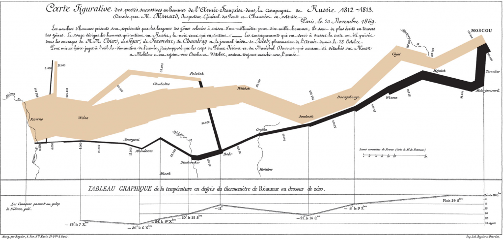
The “gold standard” for information graphics is Charles Joseph Minard’s representation of Napoleon’s invasion of Russia. Issued in 1861, the graphic captures four different changing variables that contributed to Napoleon’s downfall in a single two-dimensional image: the army’s direction as they traveled, the location the troops passed through, the size of the army as troops died from hunger and wounds, and the freezing temperatures they experienced.
Edward Tufte, a pioneer in data visualization, wrote a series of books —Visual Explanations, The Visual Display of Quantitative Information, and Envisioning Information— on the subject of information graphics. To Tufte, a good data visualization represents every data point accurately and enables a viewer to see trends and patterns in the data. Tufte’s contribution to the field of data visualization and infographics is considered immense, and his design principles can be seen in many websites, magazines, and newspapers today.
Katy Borner (Professor of Information Science, Indiana University, Bloomington) gave an overview of the exhibit Places & Spaces: Mapping Science, which she curated, and discussed the Information Visualization MOOC she teaches at Indiana University. She is interested in the development of cyberinfrastructure for large-scale scientific collaboration and computation. Ward Shelley, a New York-based artist, presented several examples of his information-based diagrams featured in the exhibition. Among them was a History of Science Fiction, which I thought was an interesting concept. The importance of infographics in geography was demonstrated by Gary Berg-Cross, a cognitive psychologist, who is executive secretary of the Spatial Ontology Community of Practice (SOCoP) project INTEROP, an Interdisciplinary Network to Support Geospatial Data Sharing, Integration, and Interoperability, a project supported by the National Science Foundation. The last speaker was Stephen Mautner, executive editor at the National Academies Press, Washington, D.C., who provided an update on an initiative to visually represent the many reports issued by the Academies as a network of nodes connected by common terms or concepts. The network is currently a stand-alone product that can be manipulated to highlight certain categories, with a drill-down facility that enables the user to get more detailed information.
I decided to write about this event because the graphical representation of data will become more important as more and more data are becoming available. Too often, I see figures in scientific publications where space is wasted, fonts are too small, or labels are missing. The forum convinced me that a bit more thought can go a long way to optimize the effectiveness of infographics.

